Creating digital engagement in physical spaces
We’re a digital agency but we’re a tactile bunch.
We’re art and we’re craft. We’re animators, hackers and hardware buffs looking for any excuse to break out the scissors or the soldering iron.
We love to play with the limits of a physical space and discover what new and emerging technologies can be brought to an experience.
And here’s a chance to share some of what we’ve learnt.
How is the real world not like a website?
When we look at a physical installation through the lens of digital design process, we can still think in terms of entry points, calls-to-action, user expectations and accessibility—it’s just the context and form that changes.
It begins with expectation.
Take the example of a digital kiosk to help shoppers find their way inside a shopping centre. The user already has a particular need and expectation of experience when they approach the screen. These types of installations have a lot in common with mobile websites. They’re about catching someone on the move, possibly in a hurry, and they need to offer quick intuitive access. They tend to exist as part of the landscape, ignored until the moment you need them, then deliver a frictionless experience to get you what you need.
However, many of our installations begin with no user expectation at all. They aren’t actively sought out. They’re just there. And we have the opportunity to create something special from that blank canvas of expectation.
A day at the Brisbane EKKA is a sensory overload. It’s all about fun and excitement.
There’s nothing quite like the atmosphere of sideshow alley. You wander around at a slower pace, being tugged in different directions. Something catches your attention and you enter into an arcade game – like popping ping pong balls into a clown’s mouth. You feel challenged for a moment and walk away with a reward (usually a small one).
So how do we take a message like “Brisbane City Council does a lot of things around the city that you probably never notice” and share it in this environment?
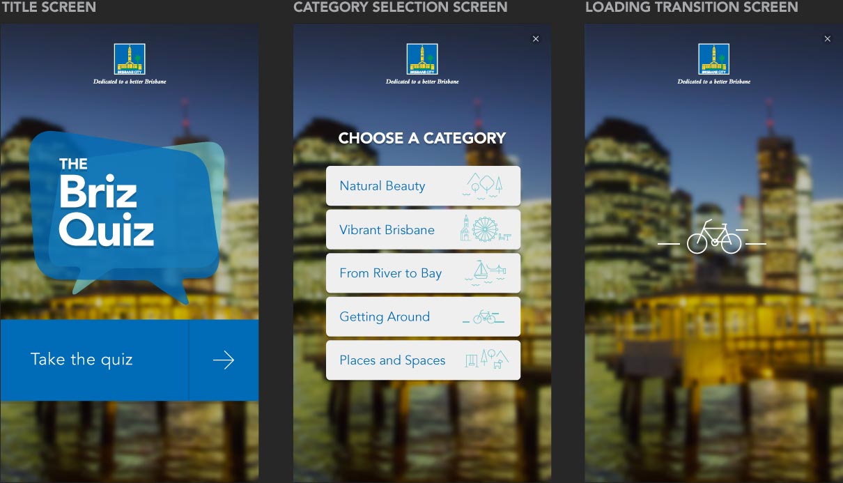
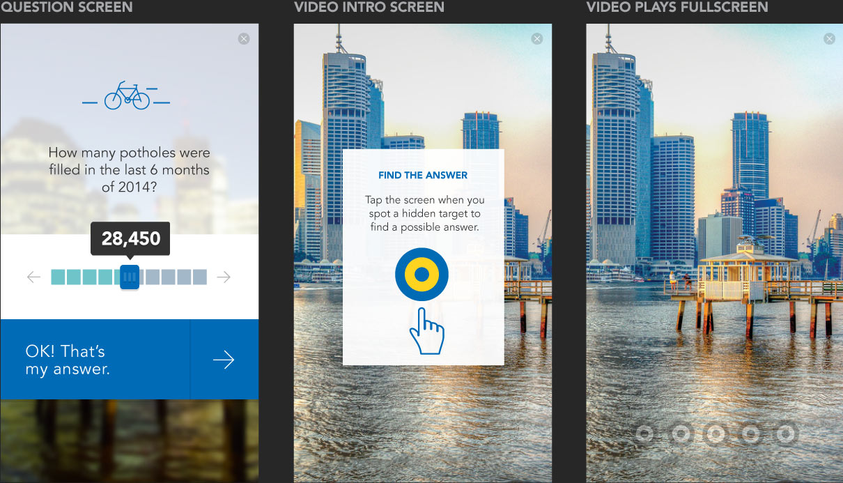
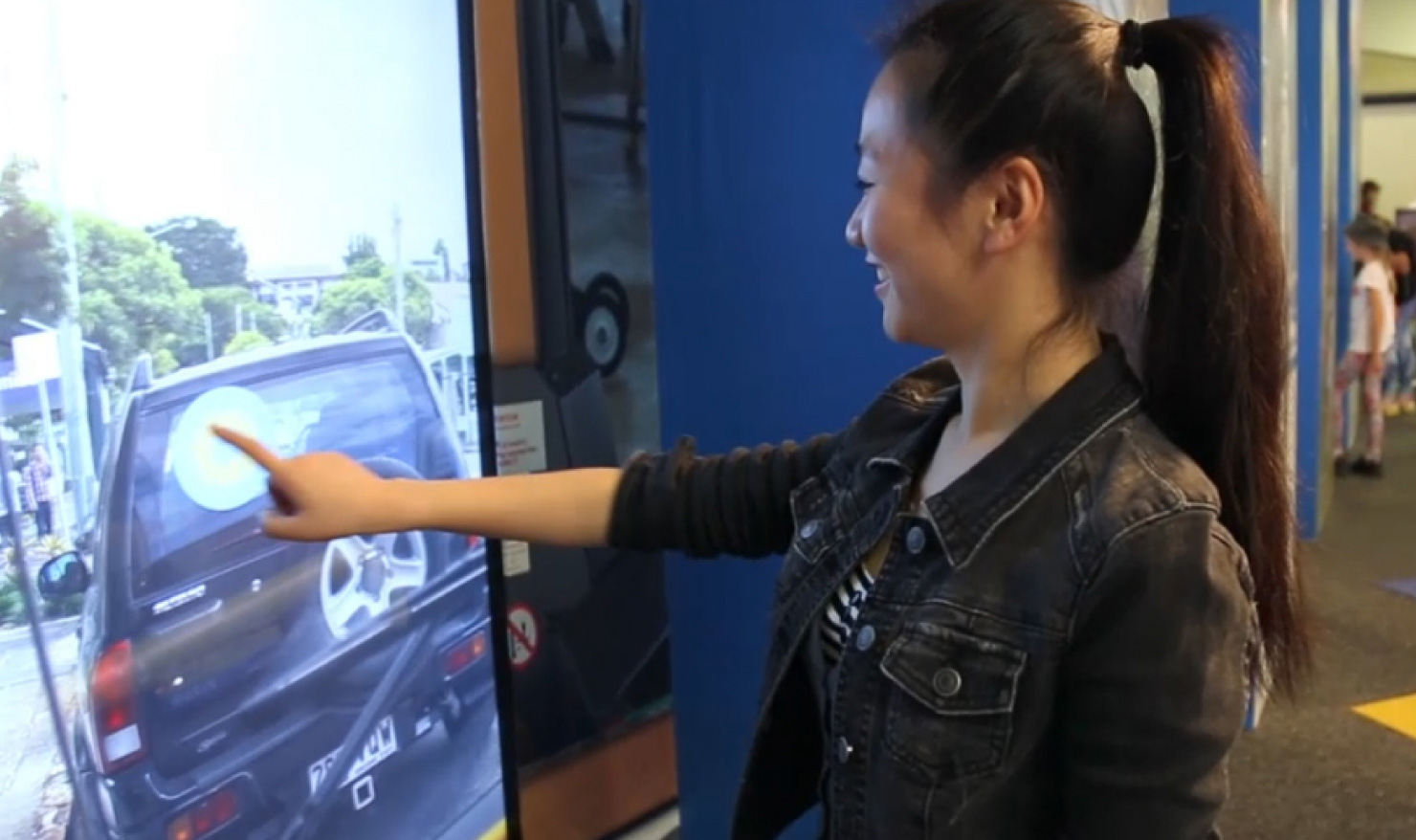
We create the Brisbane City Council’s Briz Quiz installation. Set in a quieter pavilion, aside from Sideshow Alley, we designed it to create that same sensation of wandering by then being drawn in to have a self-contained experience that felt game-like, with a score, sense of accomplishment and small reward.
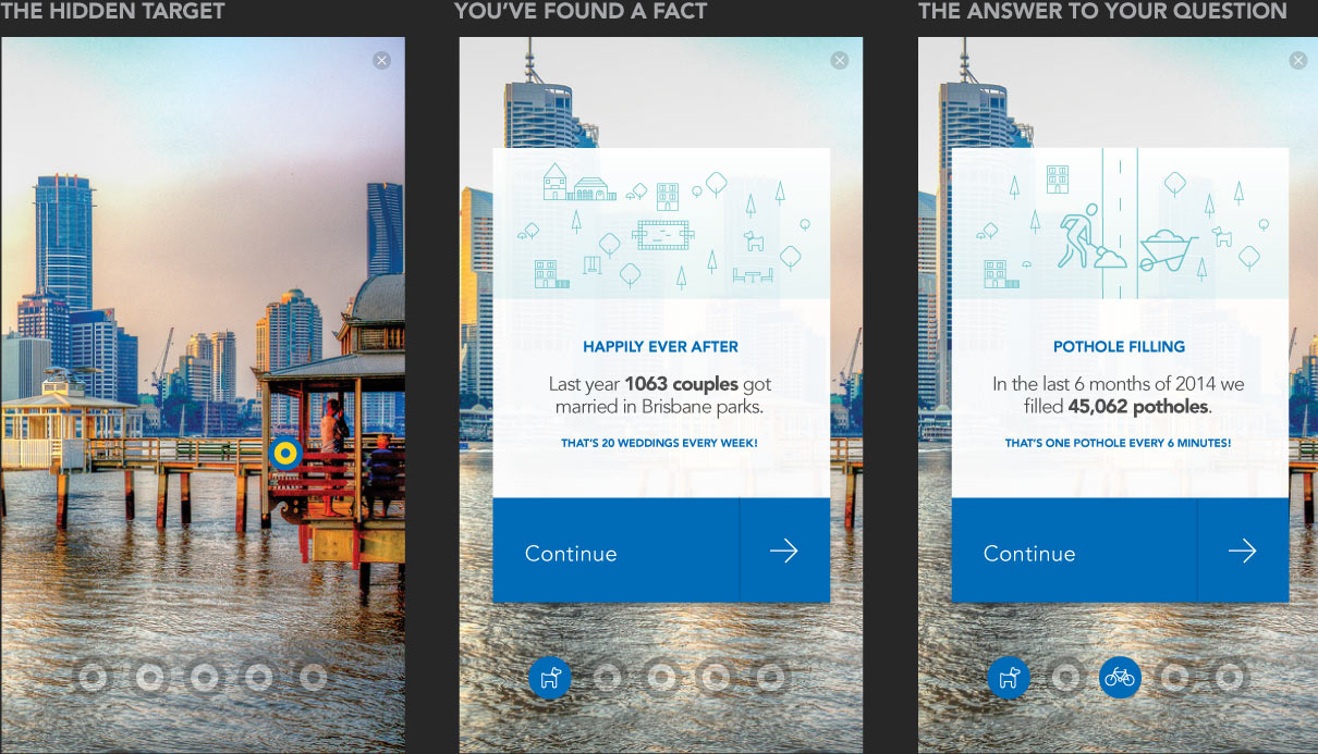
The Briz Quiz combines a first-person video tour of Brisbane with a game of finding and tapping targets hidden within the unfolding scenes. The targets themselves are physical objects in the scenes, not digital overlays, with a familiar resemblance to the kind of targets you might lob a ball at in a carnival game.
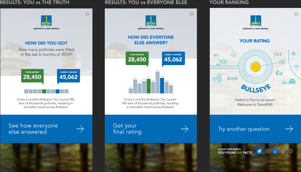
Finding targets activates a second layer of the game, which turns otherwise dry facts – like the number of weddings hosted in public parks – into a challenge of how close you can get to the real answer.
This simple act of pausing to consider your answer means a much greater chance of the stat meaning something to you when it is revealed, and it’s just more fun than just reading.
The result is something that manages to feel at home in the atmosphere of the EKKA without sacrificing the Brisbane City Council’s distinctive voice and identity. And the message stays with people.
When the purpose is to entertain and delight we get to bend some of the cardinal rules of usability.
Normally we’d aim to be utterly clear about what is a button or a link and what it does. What does the user expect will happen when they hit a button? Is that what it actually does? But to create delight we play with those expectations in order to surprise people.
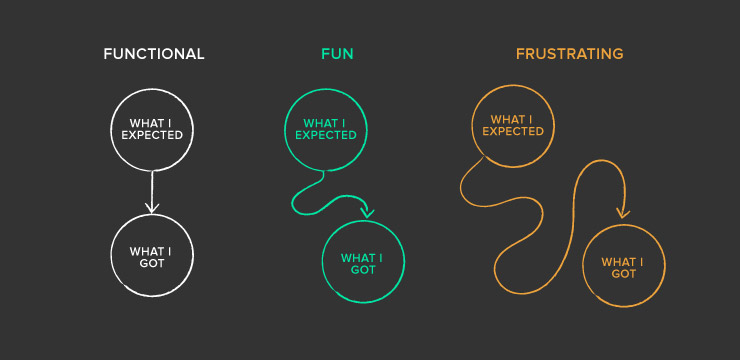
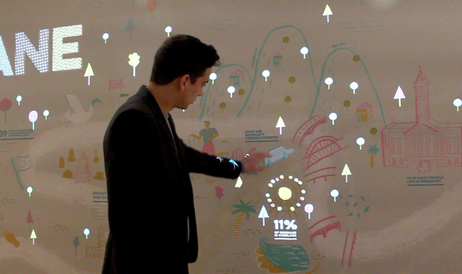
Recently we collaborated with the Museum of Brisbane for the 100% Brisbane exhibition. Working with their hardware wizards we created an interactive wall that makes the most of this gap.
The wall is a printed mural (illustrated by local artist Sophie Blackhall-Cain) that comes to life with projected animations whenever users find hidden touchpoints. As visitors approach from each end, we present invitations to touch through text and visual cues. To introduce a sense of discovery, we vary the explicitness of the cues. The aim is to strike a balance between making the cues so obvious that it takes the fun out of finding them and making them so obscure that you’d tap a dozen times before finding a trigger.
But the real fun is in seeing the wall react when you find a touchpoint. Some touchpoints trigger a little bite of information with a quirky flourish of animation. Others light up the full expanse of the seven metre wall, starting from the point of contact and spreading to fill your vision.
Considering our surroundings
We often talk about how physical surroundings should influence our design, but the opposite consideration is just as important: how will our design impact the surroundings?
If you’ve ever encountered the blinding brightness of a white LED billboard while driving at night you’ll know the effect of inconsiderate design. A gentle dimming as the sun sets and even adjusting to a warmer colour temperature can make all the difference.
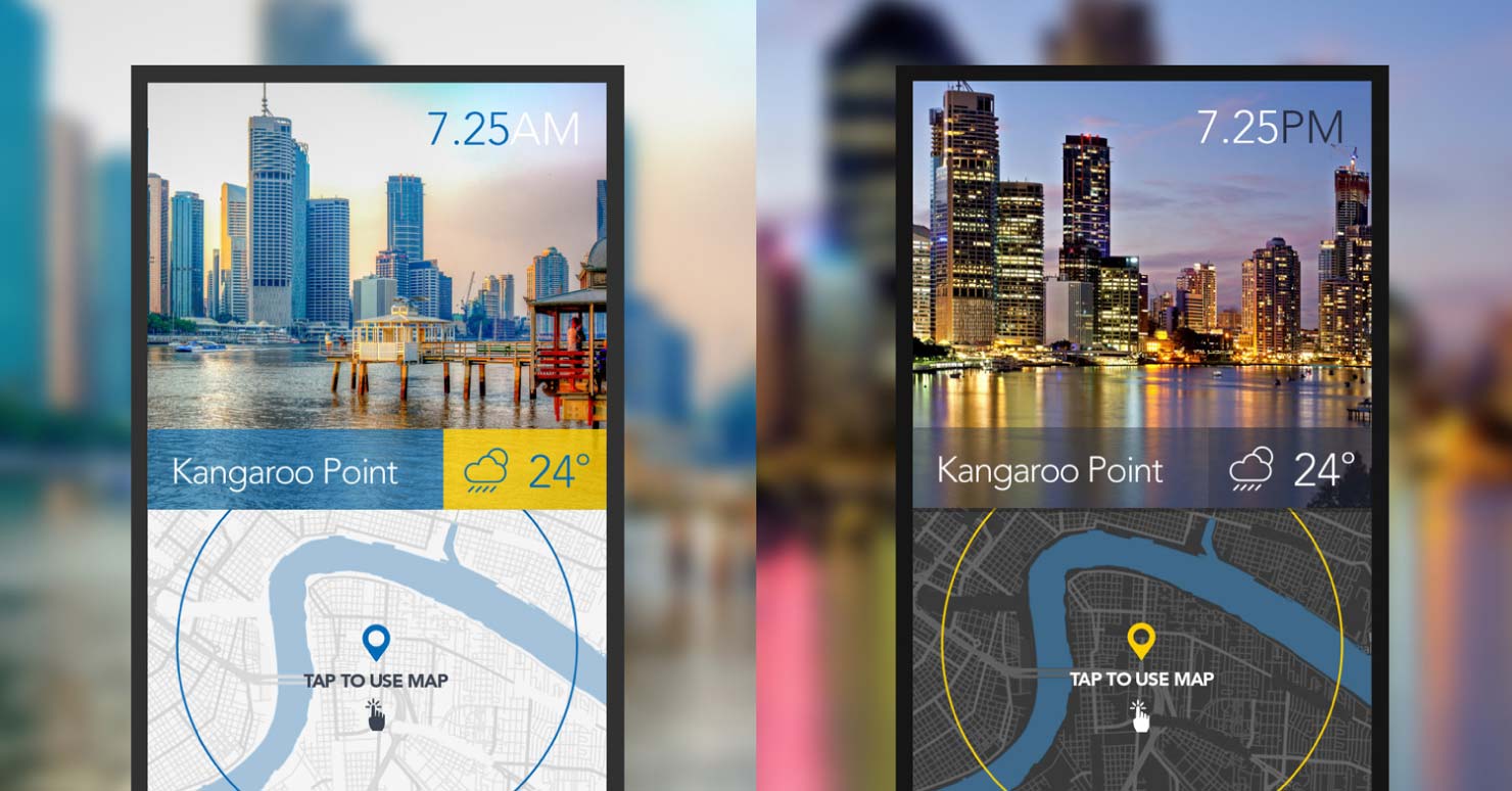
There are other times where overpowering the environment is precisely what we want to achieve.
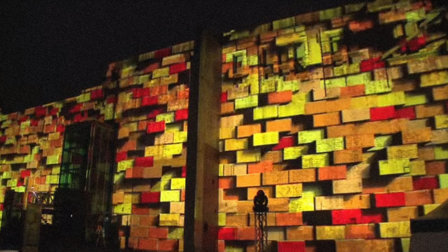
To mark the opening of the Brisbane Festival we created a 3D projection that lit up the vast expanse of the Brisbane Powerhouse. Here the installation becomes the event, creating a spectacle that transforms the environment at an awe-inspiring scale.
Taking advantage of fixed location
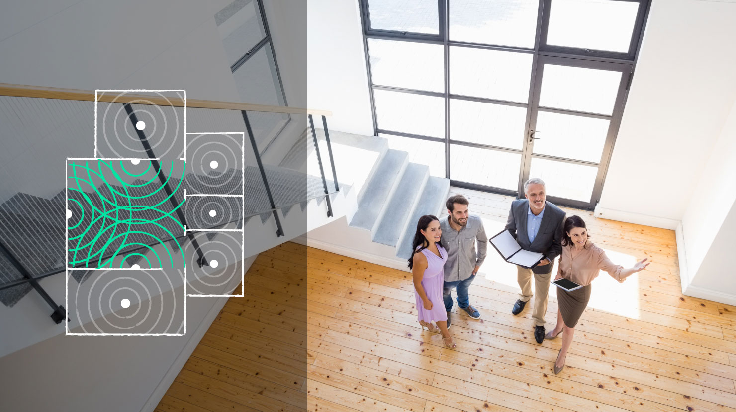
In the digital world we usually have a wealth of data to help us approximate where a user might be, on what kind of device, and we use that to provide an experience that suits the user’s context. However, it’s a rare thing to know exactly where someone is standing, which way they are facing and what exact environmental factors they are contending with.
With physical installations we have a unique opportunity to lock in some assumptions. If it’s indoors we can know the exact lighting conditions and acoustics. If the interfaces or screens are physically fixed we know where the user will be standing and facing as they use it. What can we do with that knowledge?
Prototyping
All of these environmental variables mean it’s critical to prototype at scale–and ideally, on location–as early as possible.
Physical installations are great opportunities to enjoy brutal reminders of Murphy’s Law: what can go wrong, will go wrong. It might be something common – like patchy 4G connectivity. It might be a slightly bigger problem – like the worst floods in 40 years combining with poor ventilation in an underground room to create enough humidity to cripple every monitor in an installation (our Rain Bank installation at South Bank). So we like to catch problems as early as possible.
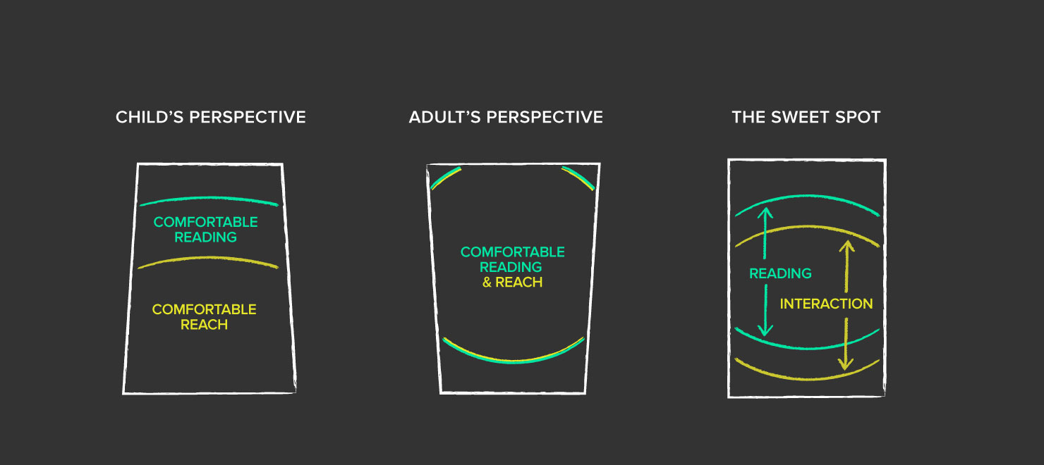
After the launch is another valuable time to learn. It’s so easy to observe people using an installation and get real-time feedback on the choices we made throughout the process. There’s nothing like unleashing a horde of kids on a school excursion to challenge every assumption you make about what constitutes “interaction”.
One of the great things about physical installations is the ability for a user to just walk right up and start using them.
There’s no app to download, no URL to enter, no compatibility issues. While users are still interacting with screens, there is something about a good installation that feels frictionless, like it’s more a part of the real world than the digital world.
Occasionally we can shed the interface altogether and provide something more extrasensory and intangible.
For the Brisbane Festival we had the opportunity to develop a lightshow which reacted to the movement of people through space.
With the release of the Xbox Kinect sensor, we saw a potential interface, and with a bit of hacking we exposed the shape and depth data being captured by the sensor and translated it into a form that we could feed into the lightshow visualisation.
This is the type of pure interaction that needs no instruction. As people move through the space you can see the moment they realise they are affecting their surroundings, and the fun they have in playing with that control.
The fun and delight in discovery that the users experience is there for us as well. It’s a driving force of our creation process.
For us, every new space or technology is rich territory for exploration, filled with possibility. It’s our unique combination of people with a shared appetite for deconstructing, questioning and creating that contributes to such a range of unique experiences. Our secret isn’t a formula, but our eclectic team and the question we ask ourselves…
“How can we transform the space around us to make something amazing?”
