Launching BAD:
Good campaign strategy, well executed
Digital can be a confusing environment for marketers.
You are presented with an abundance of tools to target audiences; many opportunities to track customers; and hundreds of data points to set up to attribute success.
Good, clear cut ideas often become weighed down with considerations of audience microtargeting, retargeting, optimising pathways, different digital ad formats, and what social media channels to use. Just because these tools exist doesn't mean they have to be used, or will contribute to a successful marketing campaign.
A campaign that is executed on digital still needs to adhere to fundamental marketing and brand growth principles, including continuously reach all buyers, acquire light buyers, build memory structures, and use distinctive assets.*
* There are many more of these principles, but these were the ones we leveraged for launching BAD.
When Liquid helped launch BRISBANE ART DESIGN—a festival celebrating the artists and designers of Brisbane—the campaign was run primarily over social media, yet the term "social-first" was never mentioned.
We knew this campaign wouldn't be about the digital channel or what we could use from our digital toolkit, but instead around the good execution of a simple and principled marketing plan.
What is BAD?
BAD celebrates the artists and designers of Brisbane and the great work that comes out of the city.
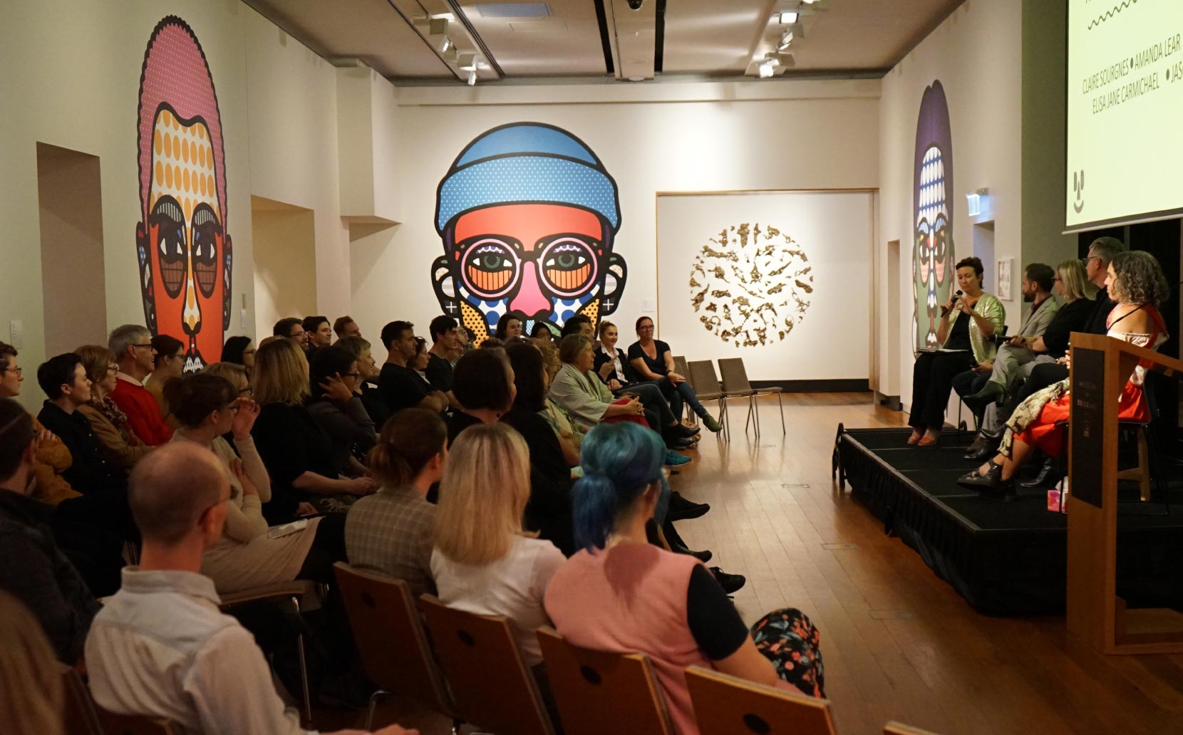
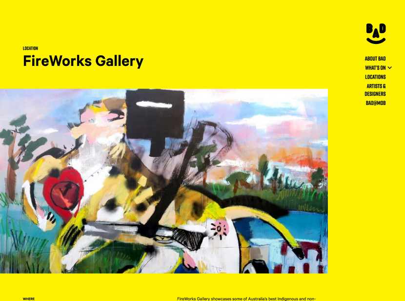
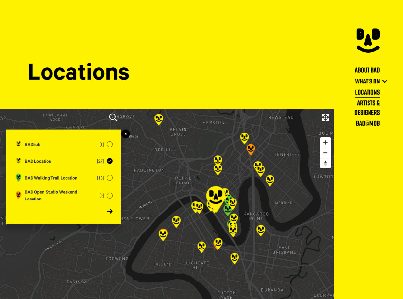
Its hub was a central exhibition hosted at Museum of Brisbane, with dozens of related BAD events spread across galleries, universities, design spaces, and other venues throughout the city.
What resonated with us was that BAD was about uncovering the hidden talent in our own city.
This was the festival’s first year of activity, with zero existing brand awareness; and Museum of Brisbane as a venue lacked the same level of saliency as Queensland Museum and QAGOMA across the river.
We had to communicate to Brisbane what BAD was, who Museum of Brisbane were, and the spread of BAD across venues in the city.
Getting the strategy right
Attendance goals were 300,000 people to events across the city, and our budget was tight.
Taking this 300k figure into account, we had about $0.09 per person to drive this attendance.
Off the bat we knew this was going to be an awareness and brand building challenge. We broke down what would really drive brand recognition on digital.
Brand recognition on digital was not about driving engagement, website sessions, or other statistics we could ‘track’ using digital tools—but about fundamental brand growth strategies of seeding brand assets to as many people as possible to build and trigger memory patterns.
We don’t want to send many people to the website at all. I think we need to focus on putting our brand in front of as many faces as possible on social media and let people’s intrigue do the rest.
Are you sure people will understand what BAD is?
No. Not at the start. But when they see the ad a second time at the other galleries, or on billboards, or on social media again—that’s when they are going to want to learn more.
Effectiveness in digital is about how the channel delivers the message to the audience and the size of the audience.
As we knew this strategy centered around awareness, we doubled down on high reach (and low cost) brand awareness Facebook ads, and ran most of our ads to as broad an audience as possible.
The website would be built for people who wanted to find it—not as a landing page.
We built our strategy around:
Leveraging the distinctive artwork
In the launch of a new product there’s a general consensus that it will take time before the new brand will resonate and cut-through with your audience—particularly if your marketing budget is small.
To effectively build brands in the above conditions, create something that is unmistakably distinct, and doesn’t look like any other brand or product on the market.
We were very fortunate to be working with artists on this project. One of the best character traits from the arts is resourcefulness. Working within your means to create amazing solutions.
So in this story, the Museum team went straight to their headline artists to design a brand for their new arts festival. In this case their headline artists were international duo Craig & Karl. Originally from Brisbane, these two have gone on to big things.
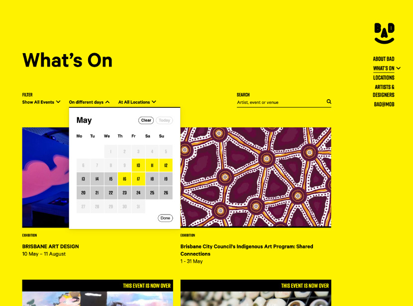
Working outside Craig & Karl’s usual brief, the outcome was a brand that doesn’t look like a brand. Yet it had immense cut-through in a small and lean campaign. We ran with this brand as far as we could—the website featured the yellow background and BAD face as soon as you entered. Most ads utilised the same yellow background, with the BAD face winking or transforming as you interacted with the ad.
As an almost fundamental rule, distinct and iconic messaging is what stands out—regardless of what channel it’s on. We didn’t feel like we had to adapt the BAD brand to social, or make it into memes, or find some sort of channel skew. We were confident that BAD had cut-through, and confident that our audience would remember what it is.
Trusting in the audience’s capacity to remember
Retargeting is the bread and butter tool in a digital marketer’s kit—showing messages to audiences who have taken a prior action or shown intent to do something.
Retargeting is a great resource, particularly for high-involvement purchase decision funnels.
However, it’s often treated as an easy stopgap for messaging frequency, or for forcing users down the funnel before they are willing to progress naturally.
This is why you may be shopping online, and then see an ad for the same product 3 minutes later on Facebook—despite you probably not being willing to purchase immediately after tabbing out of the product.
For BAD, we ran very few remarketing ads because we knew it wouldn’t be as effective as simply reaching as many people as possible (even if they only saw it once). This was based on our network of donated OOH billboards, press, and the individual marketing of the venues involved in BAD. These secondary brand and marketing touchpoints would enhance our primary digital channel, and repeated exposure would assist in building natural memory patterns and brand association in our audience.
A portion of our launch ads didn’t even feature the BAD logo—but instead unfiltered black text on a yellow background that made reference to BAD in the form of puns and jokes. This wasn’t so much to drive attention (although we knew the bright yellow would do that) but to drive intrigue and an itch in the mind of our audience that they would want to scratch when they were exposed to the brand a second, third, or fourth time.

We commenced our campaign with a large spike in our media spend for the announcement of BAD (one month before launch), before quickly dialling our media investment right back and letting people naturally come into contact with the secondary brand points.
We trusted the audience to remember BAD, the brand yellow, and the face logo, and to want to seek out more when they stumbled across the brand on different billboards.
This ended up being a great cost saving across a tight media budget, and performed much more effectively, and naturally, than retargeting ever could.
Reaching people at scale
Rather than going down the pathway of mapping out a complex digital marketing funnel or journey, we did what we could to maximise our audience reach and let our distinct brand assets and trust in our audience’s memory do the rest.
That being said, BAD had a wide arrangement of venues, events, and messages that needed to go out. These messages would not apply to our entire audience, so we built a model that determined how budget would be split.
Broader brand messages were given the most media space to the broadest audience. We used a minority of budget towards more precise targeting, inviting art-involved audiences to come along to ticketed events such as talks and tours.
This meant that people who were less likely to be invested in BAD received as broad a brand message as possible to drive brand recognition, memory patterns, and intent to attend rather than very acute messages that may have turned them off.
We also ensured that we were spending money where large digital audiences existed, rather than trying to be across all channels and spinning our wheels with duplicated reach. We stuck the majority of our spend only on Facebook and Instagram with the remainder on search ads to capture intent. We omitted other platforms such as Twitter and YouTube as we knew that Facebook and Instagram’s audience would naturally overlap in these channels. We treated all of digital as its own “channel” rather than breaking it down any further than we had to.
This consolidated platform buy saw us reach a total of 450,000 unique users throughout Brisbane, making a total of 2,400,000 impressions.


Twice as many people than expected turned up
BAD came and went so quickly.
As this was the first time this brand and festival had run, we really had no idea if our work was translating into people coming along to the festival.
We’d only had 43,000 website sessions during the festival times and the gap between website visitations and the audience goal was worrying.
It wasn’t until the dust settled and that we got the final results that we realised that this stripped back, digital marketing awareness strategy had worked beyond all expectations.
From the 300,000 projected audience numbers; final attendance was 753,167 people to events across the city.
| Digital marketing budget |
$25,000 |
| Impressions | 2,400,000 |
| Unique views | 450,000 |
| Projected attendees |
300,000 |
| Actual attendees |
753,167 |
The concept of BAD had not only stuck, but spread across the city.
The most rewarding part of that was considering that this was ¾ of a million real people who came along and were drawn in by BAD’s messaging and what it stood for.
We had the pleasure of attending one of the talks where a woman politely fielded a question to the organisers of the event: “I came all the way from Toowoomba after hearing about this on the internet. I had such a wonderful time. Will there be more like these in the future?”
Apparently the Museum is considering it.