Designing innovative digital
services for government
The Queensland Government Department of Science, Information Technology and Innovation (DSITI) want to create proactive and predictive government services that anticipate citizen needs and provide an almost frictionless, concierge-style experience.
This is an ambitious goal, made harder because they have a small team with which to influence other departments. So trying to break new ground, DSITI partnered with the team at the Queensland University of Technology's PWC Chair in Digital Economy to commission a series of innovation sprints.
These so-called NextGen sprints were more successful than anyone expected. The original commission was for three two-week sprints, and that expanded to a total of eight sprints over nine months. Each sprint has spawned new projects or initiatives within DSITI or other government departments.
This Case Study
If you've read any of our other case studies, you’ll know that we usually take a narrative approach and focus on one aspect of a project. This case study is different.
We'll first offer some observations and advice for other teams attempting to follow the same process, then a brief summary of each sprint.
Observations and Advice
The NextGen sprints were extraordinarily successful, which is why DSITI kept commissioning more of them, and why the briefs became increasingly esoteric. (“Is there no problem an innovation sprint can’t solve!?”)
However, every sprint has felt in some way like a bold leap that could have gone horribly wrong, so we thought it would be worth sharing some of our thoughts on what really made these sprints work and why.
Making a breakthrough, but keeping it real
The purpose of an innovation sprint should be to achieve a breakthrough on a previously intractable problem. But a breakthrough is not a breakthrough if it’s not practical.
Our acid test was achievability: we wanted to not only produce a breakthrough conceptual solution, we also wanted to demonstrate that the solution was technically and organisationally achievable within the next 100 days.
This is why so many of our sprints produced working code when mockups might otherwise have sufficed: the code was created to demonstrate technical achievability.
For instance, when designing a decision support tool for customers starting a small business, it would have been easy to create a clickable mockup, but we would have had absolutely no confirmation that the right data could be scraped from government websites, or that the underlying decision tree model would allow independent curation from government agencies.
Without this confirmation, it would have been all too easy for other stakeholders to dismiss the concept as mere fancy and return to business as usual. But by building an actual decision-tree service with its own branch-and-node content management system, the team proved that the approach was technically achievable, and that progress did not need to take years—we proved that under the right circumstances, meaningful progress could be achieved in weeks.
Even where the sprints focused on communications, content and strategy, rather than software, we demonstrated achievability by breaking the strategy into small, simple steps and providing samples for every step.




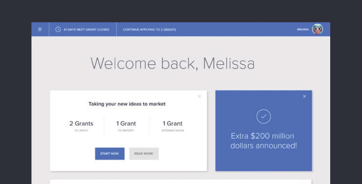
These samples not only proved that the strategy was achievable, they also showed exactly what it should look like when executed. This is important because the biggest problem that the more strategic sprints run into is not people saying, “that can’t be done,” – it’s people saying, “we’re already doing that.”
But often the difference lies in the execution—not what is being done but how it is being done.
Team composition
The NextGen sprints had a team structure that fostered collaboration across government, academia and industry.
The core team consisted of seven people:
One person from DSITI (Project management and stakeholder engagement)
Two people from QUT (Research and workshop facilitation)
Four people from Liquid Interactive (Strategy, content, design and development)
However, there were many supporting contributors from all three organisations. Some joined the sprint full-time, some stepped in to help with ad hoc requests.
Sometimes the core team grew slightly bigger, sometimes smaller; sometimes it was heavily technical, sometimes creative, sometimes analytical; it all depended on the sprint. It was essential that the team could judge its own progress and call in the right kind of support when it felt like something was missing.
And while everyone had a specific responsibility, there were a range of design, strategy and research tasks that overlapped across everyone—and it was in this cross-disciplinary flow that the breakthroughs happened.
The importance of team chemistry
A regular topic of discussion in the NextGen sprints was the chemistry of the team, and how to maintain it as team members came and went.
What seemed to be crucial was that everyone in the team bought into the culture of the sprint, which was about speed, ambition, flexibility, collaboration, pragmatism, openness and respect.
We jokingly talked about the sprint room being “a safe space”, but it’s true: everyone had to be free to say what was on their mind, and have their thoughts treated with consideration and respect.
Flexibility
Not only did every sprint have a different brief, but the needs within each sprint changed daily.
Some people found this energising, some found it exhausting, but everyone needed to be able to change direction quickly.
And it wasn’t enough to be willing to change direction; we had to be able to change direction, which came down to having team members with the right breadth of skills and experience.
Structure
Each NextGen sprint had the same broad structure:
Week prior: prep and customer research
Day 1: discovery workshop
Day 2: lock down the overall solution and get something into development
Day 3-9: design, develop and continually user test the solution
Day 10: show and tell
Week post: documentation and handover
Preparation week
Before Day 1 there was usually about a week of preparation with a smaller team.
One key task was talking with stakeholders to get a sense of what they wanted to achieve.
Because stakeholders were commissioning the sprint because they wanted “out of the box thinking”, they often did not want to be too specific in what they requested in case they skewed the thinking of the team. But our experience was that the sprints were better when all ideas were on the table, so it was better for stakeholders to say what they wanted and share their existing ideas.
Another task was finding and interviewing customers who were experiencing the problem to be solved. Ideally we conducted video interviews and presented edited versions in the discovery workshop to act as provocations.
The final task of the preparation week was to design activities for the discovery workshop.
This was less about making elaborate activities and more about making sure we had the right problems, examples and prompts, that we were asking the right questions, and that we had invited the right participants.
The discovery workshop
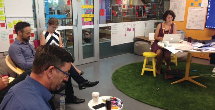
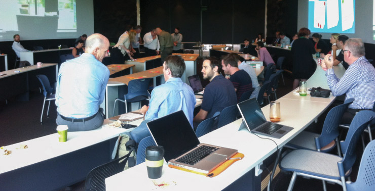
The goal of the discovery workshop was to get a lot of different people, who might never have met before, to contribute their thoughts, experience, and possible solutions for the given problem. This also helped bring the sprint team up to speed.
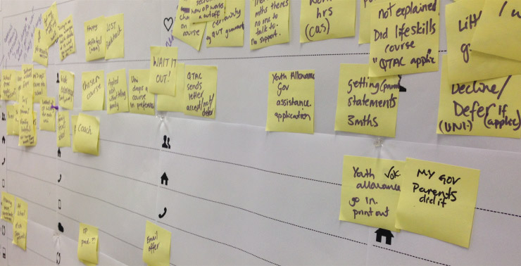
The better the preparation and framing of the problem, the better the workshop.
The best formula seemed to be to present a challenging situation, and then work the stakeholders through activities that explore the situation and produce alternatives. The discussions were often surprising and went way off course. This was good so long as the group were continually referring back to concrete people and concrete problems.
Quite often all the ideas we needed to create an effective solution were laid out right at the start, just waiting for synthesis.
Lock-down, design and development
On a development-heavy sprint, it was important to lock down a design that could go into development in the first two or three days, otherwise we wound up with developers twiddling their thumbs for the first week and then staying up all night for the second week.
So design would continue throughout the sprint, but development worked with a locked off first draft while design continued iterating on mock-ups, and we presented both of these at the end.
We had an ongoing discussion as to whether we should move to a three-week structure where design was heavy for the first two weeks, and development for the last two weeks.
But we never moved to this model, perhaps because we became more disciplined about design lock-downs by day three, and because we were nervous about losing compression.
Check ins
The sprint team intentionally worked in a skunkworks-style off-site bubble, but it was critical that we didn’t lose contact with reality. So we had key stakeholders come through every couple of days and review the work in progress.
Sometimes these meetings were an enthusiastic validation of everyone’s work, other times they were a source of tension and ideas and reality came into conflict, but either way they were helpful.
Presentation design
For our first few sprints, our presentations were entirely product-oriented, so we didn’t put any effort into presentation design: just a link to a live demo, and a few screenshots.
However, at Sprint 4 we started dealing with problems in organisations and cultures, so techniques like storytelling, illustration and rhetoric became much more important, and the presentations became correspondingly elaborate.
We evolved a system where on Day 5 “the presentation” would become a topic of conversation. On Day 6 extended outlines appeared, and by Day 7 we had usually started preparing assets and slides. Day 9 would then turn into an all-hands-on-the-Google-slides affair while we finished the whole thing off.
Getting the presentation right was about getting the argument right. It was about checking our facts and our ideas. It was about making sure the right things were being presented in the right order, at the right level of detail, so the audience understood what we were saying, and believed in the course of action we were recommending.
Presentation day
The goal of the presentation was to show the completed work, get feedback, and inspire further action.
We would invite back everyone who came to the discovery workshop, as well as any new people we met along the way.
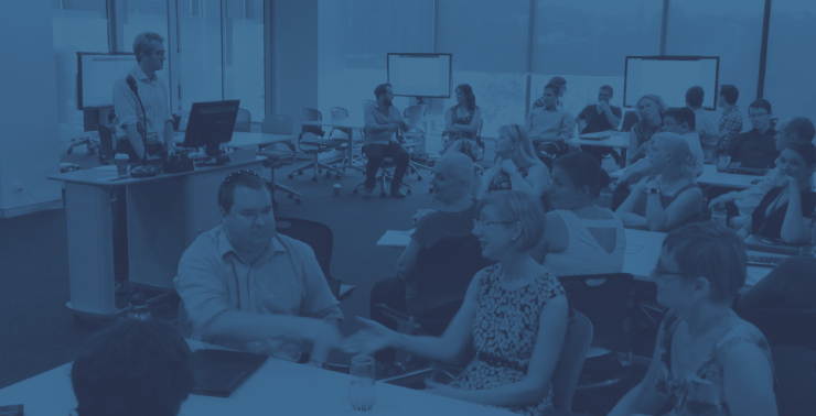
What we noticed was that on the technical sprints most of the people who came to Day 1 would also come to Day 10. On the more strategic sprints, far fewer people come back.
Our theory was that on the big strategic sprints, people were so sceptical that there would be a solution they didn’t bother returning. We thought that was slowly changing towards the end, as more and more people saw what the strategic sprints could produce.
Handover week
Finally, we had all the housekeeping. When the sprint was done, the intensity and drama over, a skeleton crew would stay behind to write documentation and reports, package up the deliverables and hand over to internal teams.
This was an important part of the process. Even though the giddy magic of the sprint had ended, the handover needed to be done right or the sprint was a waste of time.
Creative desperation
A key theme of nearly every sprint was creative desperation.
Every sprint was different, but because the problems were so complex and the timeframes so short, they all came to share a MacGyver-style race-against-time grab-anything-useful oh-god-let’s-jump kind of vibe.
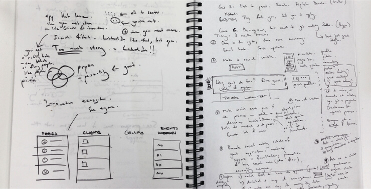
What this creative desperation meant is that we didn’t have time to reinvent the wheel; we had to grab the best of what was already out there, or whatever we felt was the most obvious solution. This worked because so often the best new ideas are just novel combinations of old ideas anyway.
Sleeping on it
This is an under-rated observation, but “sleeping on it” played a huge role in the outcomes of these sprints.
It’s a pretty typical creative story: working all day with intensive focus on a single complex problem, going to bed thinking about it, and then when you’re having a shower the next morning you’re struck with a sudden insight.
Only certain members of the sprint team seemed to do the sleeping-on-it routine, but you knew who they were because they would burst in late having missed the stand-up to tell everyone we needed to change direction.
Early in the sprint these insights could cause significant changes in direction, but after that they tended to settle down into more modest executional breakthroughs.
Co-location
Co-location is critical to sprint success, but it’s worth understanding why so you don’t get too absolutist about it.
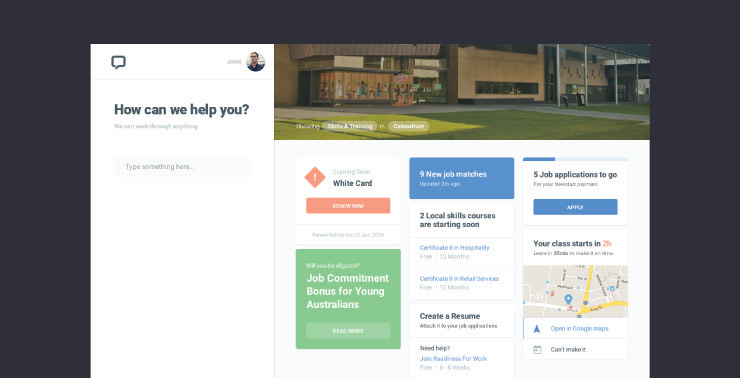
The benefit of co-location is it enables communication by osmosis. Briefings are almost entirely eliminated and team members simply learn by eavesdropping on each other’s conversations.
Often changes get made to designs and code without anyone needing to give explicit instructions. If the co-located team is communicating openly and listening to each other, and everyone is empowered to do what they think is best, then information and decisions just bubble through.
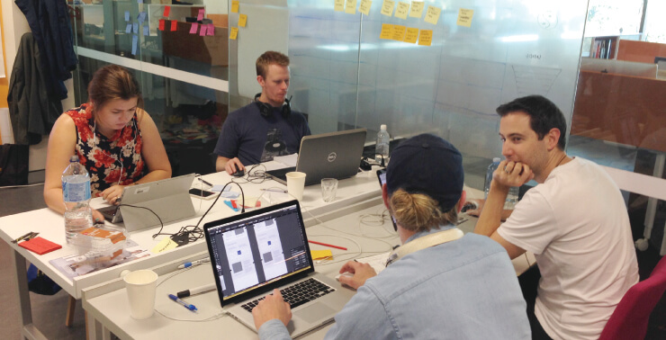
We should point out that a side-effect of co-location is that the team builds up a depth of tacit knowledge that is hard to capture and transfer to outsiders.
This can make the team look like a bunch of wild-eyed zealots who understand secrets that nobody else gets, and it also creates a barrier to entry for people who want to dip in and out of the sprint team.
Despite having said all that, every NextGen sprint had drop-ins, or people working remotely on specific tasks, and some of that work was highly influential. Also every sprint had periods of core team members dropping out to go work on other things, and the results have still come out okay.
So there’s no need to mandate that everyone involved must be co-located at all times. But you should definitely know who the core team is and make sure they are co-located as much as possible.
Drop-ins need to accept they are not part of the core team, which means they are essentially guests and need to defer to the core team. So if you’re a drop-in with a great idea, don’t be surprised if the core team dismisses it and moves on.
And if you’re basically part of the core team but not co-located, then you have to figure out the right times to be in the room in order to get the best information and contribute the right ideas.
All these sprint-based service design processes are more similar than different because they are created from the same atomic parts—cross-disciplinary teams, tough problems, co-location, user empathy, time-boxing, prototyping (all of which are staples of Agile, Lean and Human Centred Design).
It’s just the specific recipes that vary to taste, which is probably as it should be.
How might we provide emergency housing to break the cycle of poverty, but do it in a way that encourages resilience and independence instead of an ongoing dependency on public services?
Our solution had three layers.
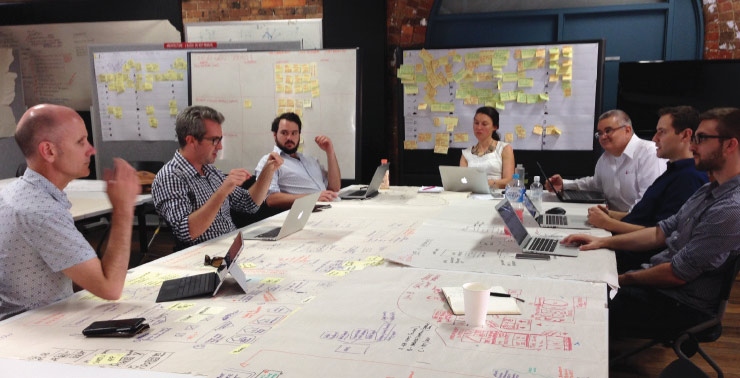
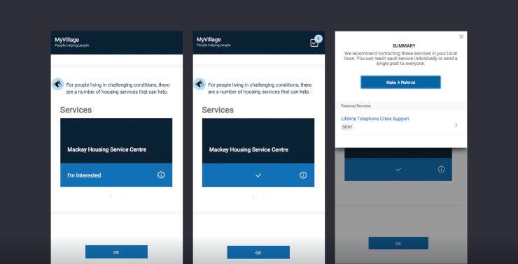
The foundational layer was a personalised dashboard that curated relevant government services—not just static information or links, but live services that the citizen could interact with right there in their account. Crucially, these services would not be limited to emergency housing but would also promote the kind of services that could break the poverty cycle (for instance, job training and unemployment services).
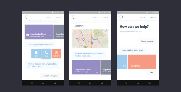
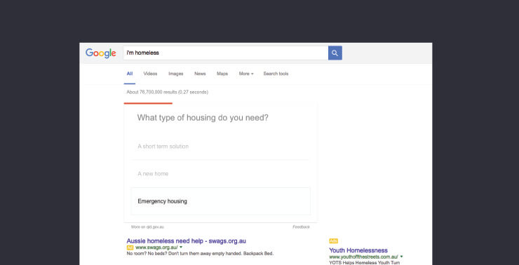
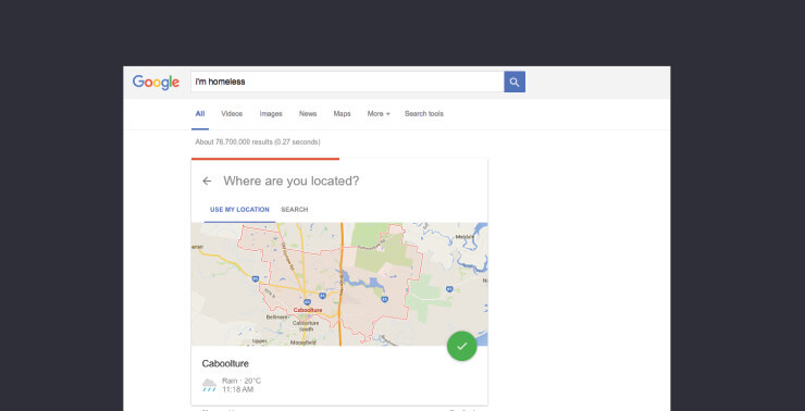
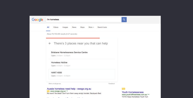
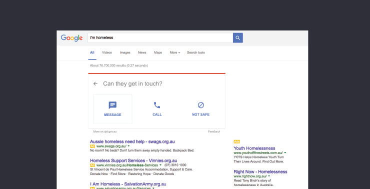
We also prototyped a digital personal assistant that could give you advice when you went through a major life event, such as becoming homeless. We developed a conversational system that aggregated metadata on over 100 housing and homelessness services—including crisis centres, rental support and counselling—and connected a user to the most relevant services depending on their location and need.
The third layer was more speculative: if a user searched for terms such as homeless or emergency housing, could we embed the personal assistant in the knowledge graph results area on Google? (We weren’t entirely sure this was possible, but Google has a history of collaborating with governments on critical keywords, so we mocked up what an end result might look like.)
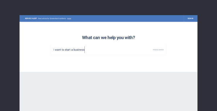
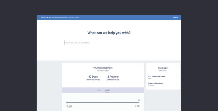
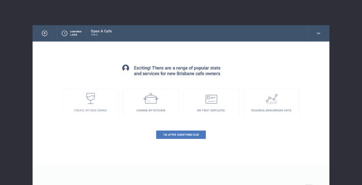
The brief for sprint two was to make it easier to open a café in Queensland—and potentially easier to set up any small business.
Opening a café sounds easy, but the process traverses three tiers of government—state, local and federal—and many separate departments. A prospective café owner might need to complete dozens of applications for licenses and permits, with uncertain costs, wait times and dependencies.
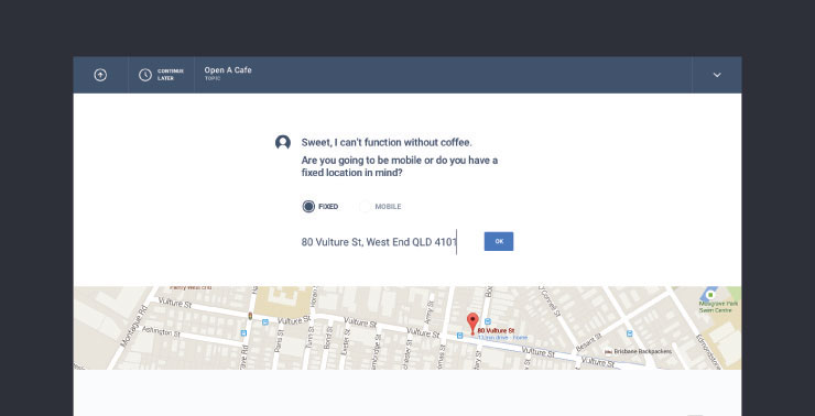
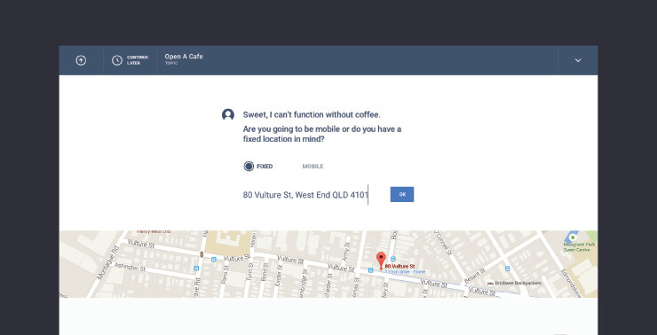
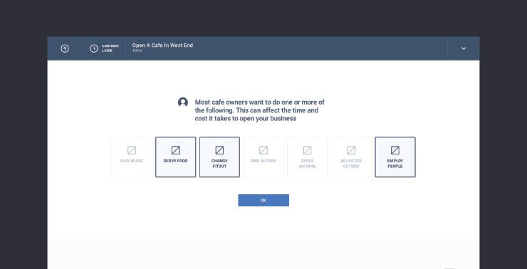
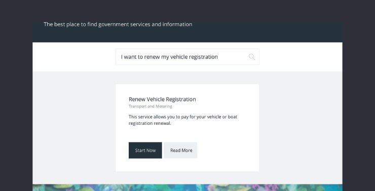
We expanded on our personal assistant ideas from Sprint 1. We demonstrated some basic keyword substitution to interpret user questions at the start, then stepped the user through a series of questions about what they wanted to do in their café.
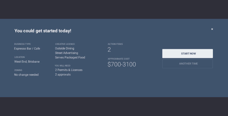
As users answered each question the assistant would collect the relevant licenses and permits for them, and gave them a brief summary of each, with links to further details that could be bookmarked for reference.
Since one of the biggest complaints from café owners was that they didn’t know how long the whole process would take or how much it cost, the prototype provided estimates of both time and cost based on the user selections.
Again, this prototype wasn’t just a clickable mock-up. The team created a decision tree content management system, with a permissions system so that different government agencies could manage their own branches of the tree. The system scraped data from dozens of government websites and services, across all three layers of government.
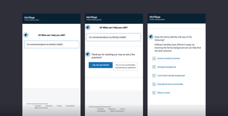
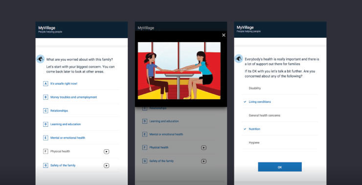
In many communities, the first people who notice that a family is in crisis are not formal authorities but shopkeepers, childcare staff and other community members. The problem is that while these people might notice something is wrong, they don’t necessarily know whether to take action, or what action to take.
How can we empower these first responders to make the right distinctions and provide appropriate help to families in crisis?
This is a complex space to navigate. One of the discovery workshop participants provided a workflow developed for child safety officers to use when making assessments, and this formed a perfect scaffold for the sprint team, who set about essentially digitising the decision making process reflected in the workflow.
The discovery process also revealed that first responders really needed further education to be able to distinguish between false alarms and genuine crises, so the team took inspiration from our MindMatters project and created in-line animations that could help answer common questions as the user progressed through the workflow.
This sprint saw the NextGen process applied to communication, culture, and organisational knowledge sharing.
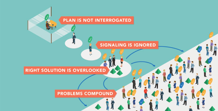
The sprint began with a brief to improve a variety of technical digital service delivery issues within DSITI, but as we dug into the problem it became clear that other teams had already solved most of the issues—only the knowledge wasn’t being disseminated.
In response, we wrote the DSITI Manifesto, a set of cultural principles that we believed would help DSITI function better as a department, and showed how these principles could be used to guide the organisation through a number of well-recognised scenarios.
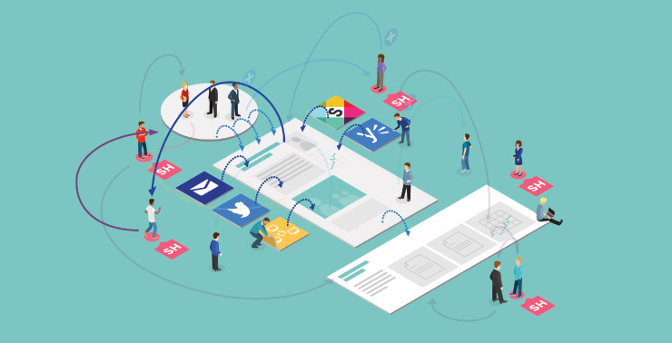
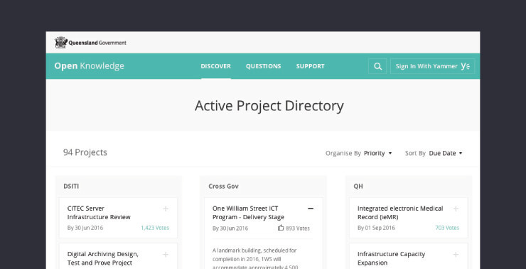
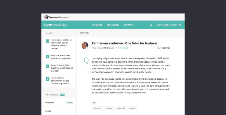
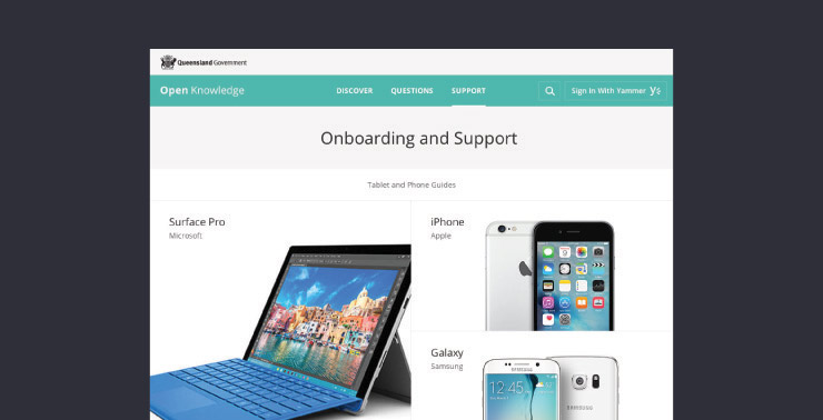
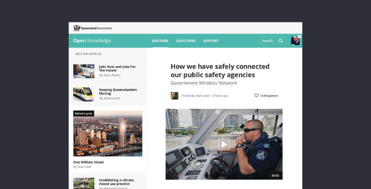
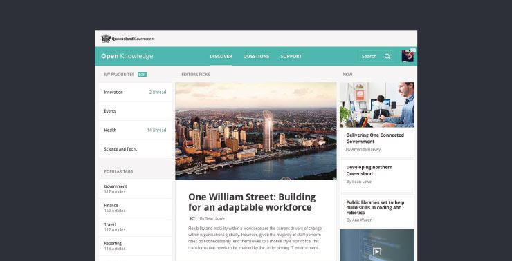
Second, we created a detailed mockup of a knowledge sharing platform optimised for organisational story-telling and reputation building. Since a new platform would be useless without quality content, we also provided sample content and a detailed content creation strategy.
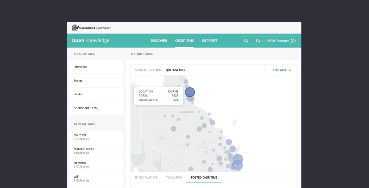
Finally, to provide a quick win that didn’t require any cultural or behavioural change, we used Tableau to create a series of data dashboards that took existing ICT datasets from around the department and turned them into visualisations that could be interpreted at a glance.
As citizens, we think of government as a single entity. The actual division of government into departments and agencies, the distinctions between federal and state, these don’t have any relevance to the citizen, especially when they often get renamed or moved around.
So why do we make citizens figure out which services they need and where to find them? How could we give each citizen their own personal government home page and curate relevant services for them in that one place?
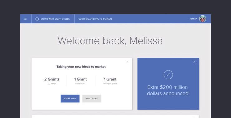
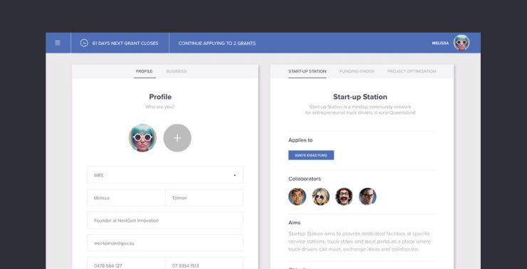
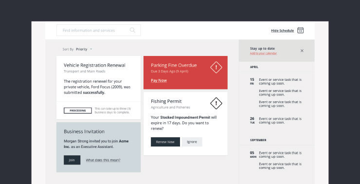
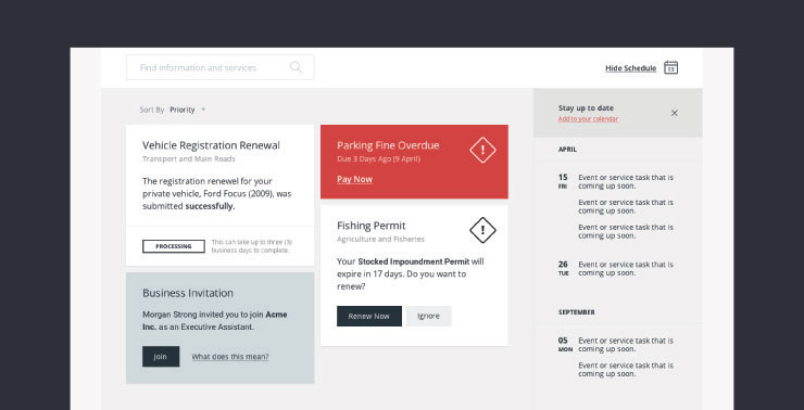
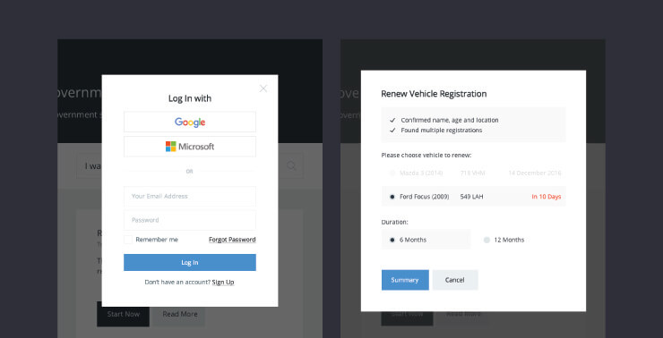
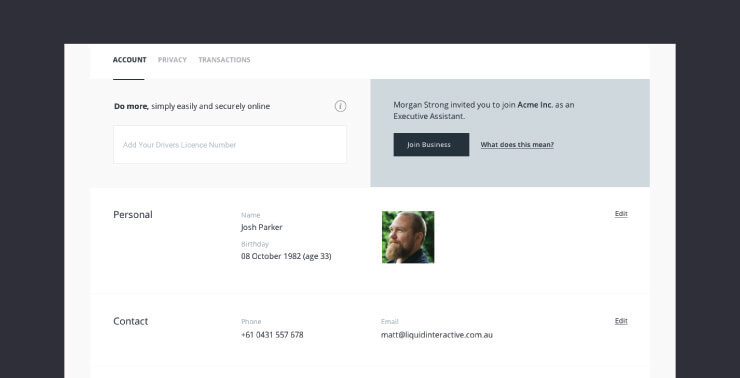
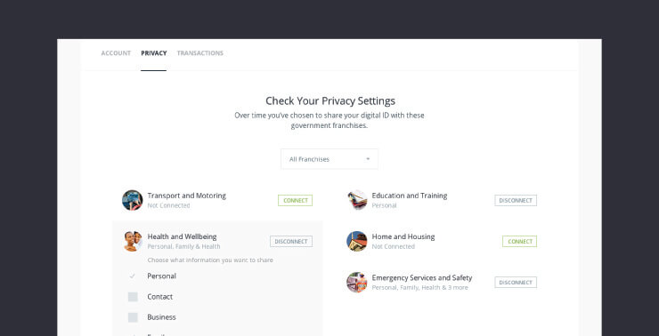
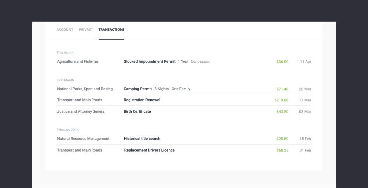
Inspired by the personal dashboard concept from Sprint 1, the goal was to develop a citizen’s account page that was personalised based on selectively shared data from the citizen, and was able to turn otherwise lengthy form-based transactions into simple one-click actions.
The concept represented a fundamental shift in mental models from forms to profile settings, and from seeing government service account pages as being department-centric to being citizen-centric.
It also meant seeing the account page as not only a place for transactions and notifications, but also a place for proactive communication and promotion based on the identity and needs of the citizen.
The team produced a complex prototype of the account page. It allowed users to login with a variety of authentication levels. Users could then perform simple transactions with other departments, and see content customised to their profile.
The personal account is one of the most exciting concepts we’ve produced because it completely changes the relationship between citizen and government, and radically simplifies provision of services.
The state wanted to position itself as a world leader in innovation and technology, and as a great home for both start-ups or mature digital companies.
This isn’t easy. Queensland, having marketed itself so effectively as a tourist destination, has created a brand that undercuts its identity as a hub for innovation and expertise.
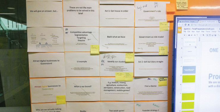
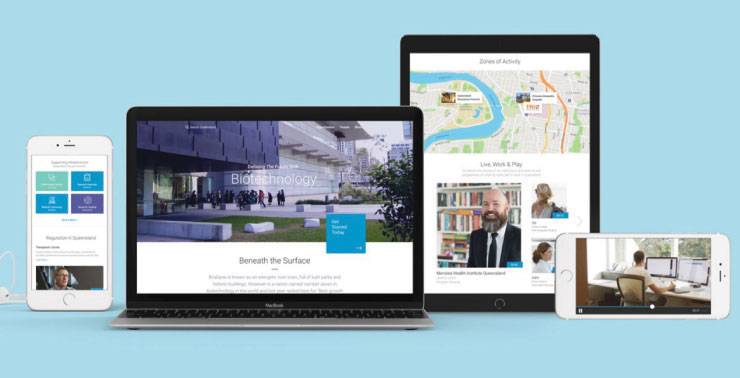
For this sprint we dug deep into cluster theory, consulted with a range of experts, and threw in our own experience with digital marketing and design to produce a three-part, 25-step economic development strategy that covered everything from cultivating clusters through to a poster campaign that could run in air bridges at the airport.
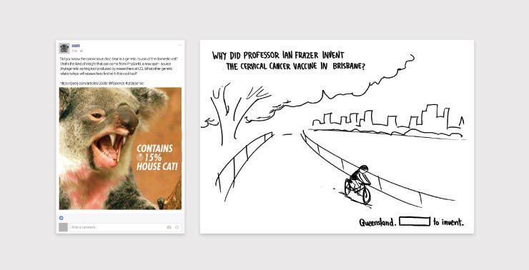
We tried to avoid the pitfalls of Big Strategy by toggling between macro and micro views. So for each step of the strategy we created specific examples of deliverables, including sample outcomes from a cluster-development workshop, sample social media posts promoting work within a cluster, and a mockup of a cluster-specific landing page.
Finally, even though the strategy is long-term and multi-dimensional, we wanted it to generate value within weeks, not months or years, so we designed it with lean principles in mind: requiring a small delivery team, able to be executed quickly, and generating value at every step of the process.
Sprint 7 explored ways to use data to measure and improve the effectiveness of government initiatives. However, the discovery workshop gave us the sense that this was well-trodden territory, and that all the most obvious ideas had already been tried and abandoned.
In response, we tried to restate the problem as something we felt like we could solve. We found ourselves wrestling with the fact that data is not inherently informative or persuasive. Data relies on interpretation and communication, which means that good data is useless if the messenger isn’t perceived as trustworthy.
So our final problem statement was: how can we use data to improve public trust in government?
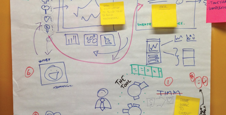
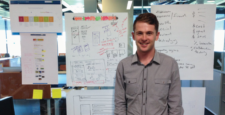
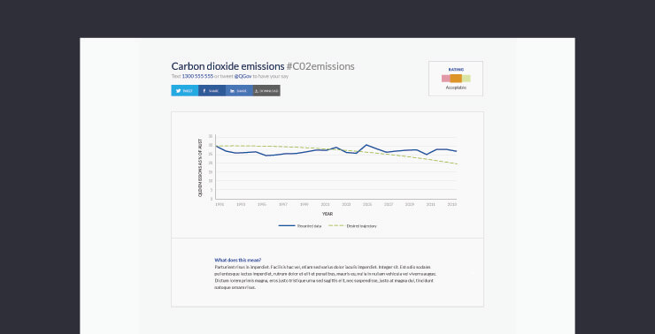
In response we produced a communication strategy, a set of interface designs, a working digital prototype, a collection of over 150 data sources, and a research pack.
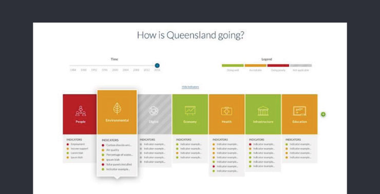
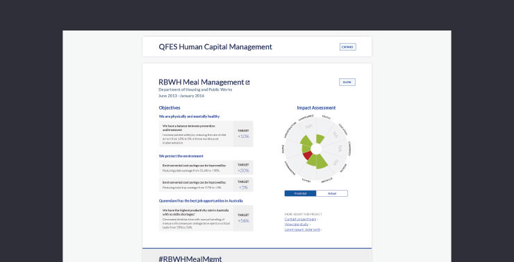
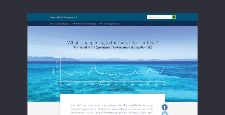
At the heart of our solution is a data dashboard that visualises key indicators of state performance in relation to government goals, and displays standardised information about government initiatives. The platform aggregates both direct and indirect public sentiment on specific indicators, and creates a channel for long-form data-journalism to explain public policy.
The idea of a public dashboard is nothing new; the innovative part of the sprint was the communication design around the data, such as the notion of presenting public policy as a metric overlay on objective data sets.
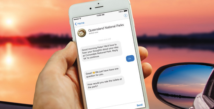
Additionally, we suggested strategies to improve the diversity of design thinking in major government initiatives, and mocked up some new approaches to gathering citizen feedback.

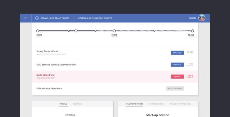
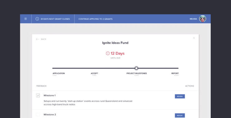
How do we make it easier for small businesses to access different types of government assistance for innovation?
Similar to some of the other strategic sprints, we came up with both technical and organisational solutions for this problem.
The technical solution was to design and develop a grants decision support tool that would walk users through a discovery process and then recommend relevant sources of support, similar to our earlier sprint work on cafés and crisis support.
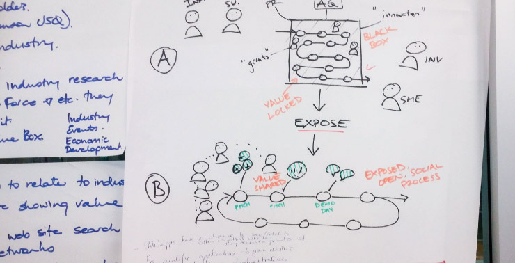
For the strategic response, we created a 10-part strategy presentation that started with small tweaks to the grant application process and ended with government reimagining its role as a lead entrepreneur in the areas of innovation underserved by private equity.
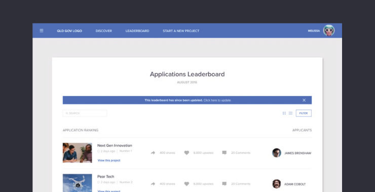
The presentation included process models that showed how the grants process could generate more incremental value for all stakeholders, including customers, collaborators and competitors, and mockups for a Kickstarter-style grants application platform that encouraged more transparency and openness.
