Co-designing a digital
government service


Head to Health (H2H) is the national digital mental health gateway, improving access to mental health support for all Australians.
It has set a new benchmark for co-design in the digital mental health sector. This complex collaboration has brought together over 40 community members with lived experience of mental health issues, 30 service providers at both executive and operational levels, mental health professionals, government staff, and five vendors covering project management, design and development, co-design facilitation and user research.
Why the need for a mental health gateway?
Although Australia is a world-leader in mental health literacy, a 2014 National Mental Health Commission review of mental health programmes and services found that many people still don’t get the support they need.
In particular, consumers aren’t aware of the wide range of government-supported digital mental health resources that can offer peer to peer support, programmed activities and professional guidance.
In response, the Australian Government Department of Health commissioned a new digital service to help Australians find web and phone-based mental health services.
Co-designing a digital government service
There are many challenges in creating this kind of service, including providing appropriate suggestions on a topic as complex as mental health, navigating the interests and concerns of a wide range of service providers, and establishing the right attitude and emotional tone across the site.
Even the diversity of the audience is challenging: the site needs to serve all Australians, across all ranges of literacy, age, location, culture and mental health experience.
The way to resolve these challenges is to work closely with end users, and we were lucky that co-design had been part of the DNA of this project well before we were brought on. Professor Jane Burns, of the University of Sydney, and the late Jackie Crowe, mental health commissioner and strong advocate for community inclusion, had led an extensive co-design process for 12 months before we joined the project.
The process was centred around a Core Community Group of members with lived experience of mental health issues, plus additional groups of service provider leaders, frontline service delivery staff, and mental health professionals.
We held monthly workshops with the Core Community Group, facilitated by the excellent team at ThinkPlace. Results from these workshops fed into reviews and working sessions with the other stakeholder and specialist groups throughout the project.
Additionally every page of the site was co-written with members of the CCG, with multiple rounds of revision, consultation and collaboration.
This level of engagement was vital for two reasons. First, Head to Health needed to represent the voice and interests of this entire stakeholder group, who had priorities that were sometimes shared and other times conflicting.
Second, after decades of passionate advocacy from lived experience consumers, the Australian government wanted to engage in community-led design to genuinely represent the needs and values of the community.
Defining a product strategy
Through the co-design process we came to focus on the most important differences in audience members: their level of mental health literacy and their level of distress at time of use. This allowed us to design a service that could offer support to users at any point on either of those two dimensions.
After considering a range of options, including an entirely chat-based solution, our strategy became to create a site with four pathways:
 topic pages
 search
 chatbot
 crisis page
Each path guides users to a common pool of resource cards, with sophisticated metadata enabling the right cards to be surfaced for the right needs.
Creating a brand personality
This co-design process established clearly that consumers didn’t want anything clinical, and they didn’t want stock photos of people looking sad.
The demand was to find a way to present mental health and illness as being completely normal and commonplace, to convey a sense of strength and community without being saccharine, to represent diversity of people, place and experience, and to have a distinctively Australian flair.
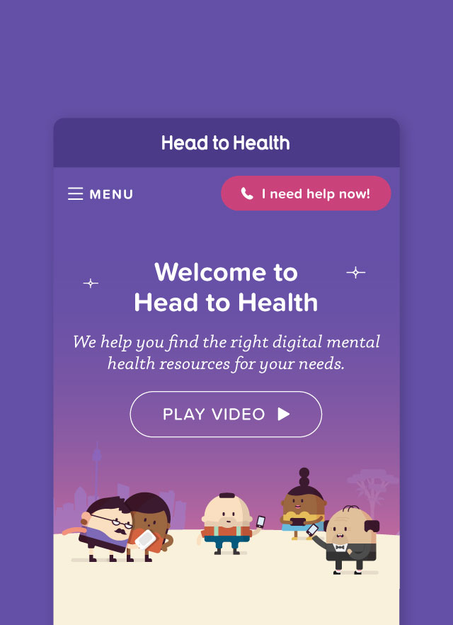
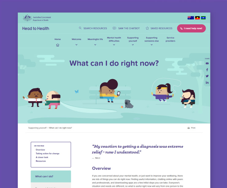
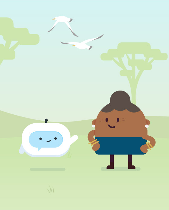
We tested a range of illustrative, photographic and textual approaches in workshops and surveys and eventually settled on a direction based on little ‘Lego-style’ characters we took to calling digis.
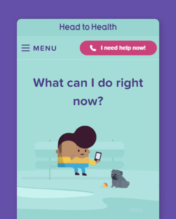
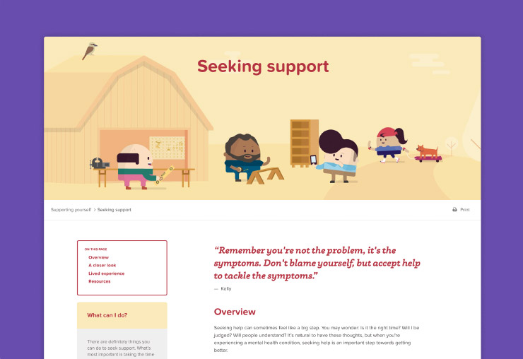
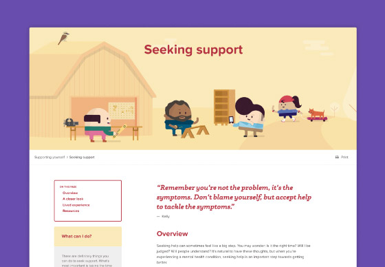
These characters allowed us to create our own brand world with a variety of characters, props and settings. We could combine these to make everyday scenes at the head of every page, which set the right emotional tone for the whole site. To stop the digis seeming too youthful, we carefully established conventions around hairstyles, wrinkles and clothing, and we created a flexible but organised colour system used throughout.
The creative approach wasn’t without its risks: some stakeholders feared it was too childish for what is in some circumstances a serious and distressing issue, and certainly there are some users who don’t like the style or, read unintended meanings into the everyday scenes.
But overall the identity has met with an enthusiastic response, with most users saying they genuinely appreciate how the art style and design create a positive and normalising experience.
Developing the technical platform
The core of Head to Health was built with Sitecore CMS, which proved a powerful content management system as it provides:
- a robust framework for managing large volumes of data
- advanced and flexible APIs
- highly scalable architecture
- intuitive user interfaces for managing content across multiple sites, languages, and teams
- ability to track anonymous users across multiple websites using Sitecore Federated Experience Manager (important when H2H sits within an ecosystem of sites and we want to track user journeys from the H2H site to linked service provider sites)
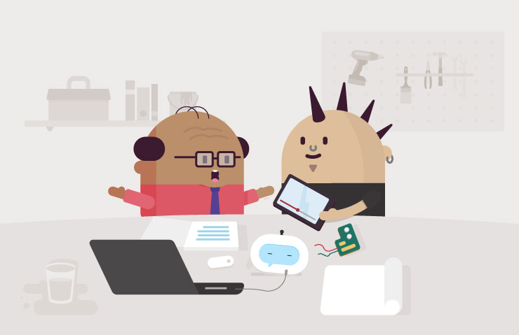
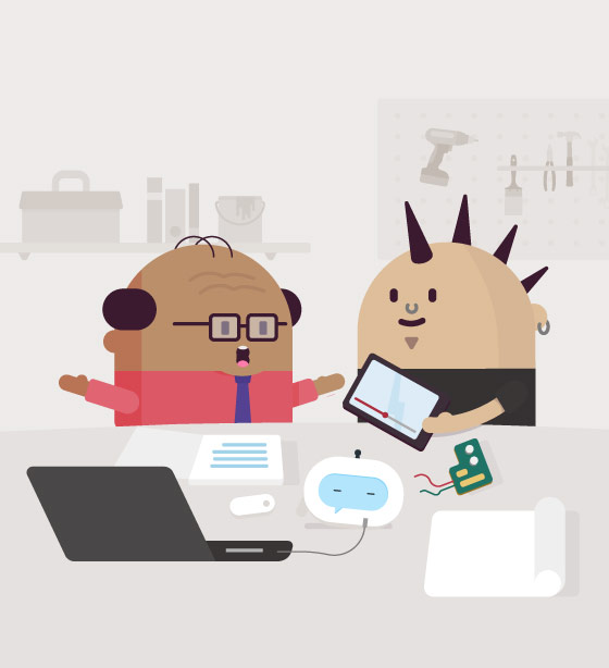
At the heart of the site are resource cards. Standard text search wasn't going to work because individual cards could map to different queries in different ways, so we developed a cross-referenced tagging system that allows for complex relationships between cards and different types of clinical and symptomatic search terms.
This collaboration helped us resolve a particularly difficult problem around how to make recommendations in such a complex space, with confusing overlaps and ambiguities within consumer needs and mental health services. We were able to invent a set of rules that not only classified resources, but also captured relationships between them and consumer experiences, so that we could make more fine-grained suggestions.
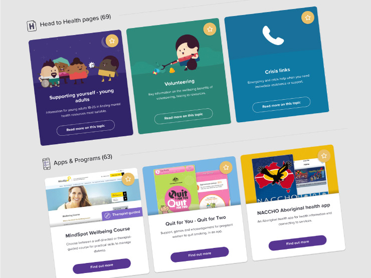
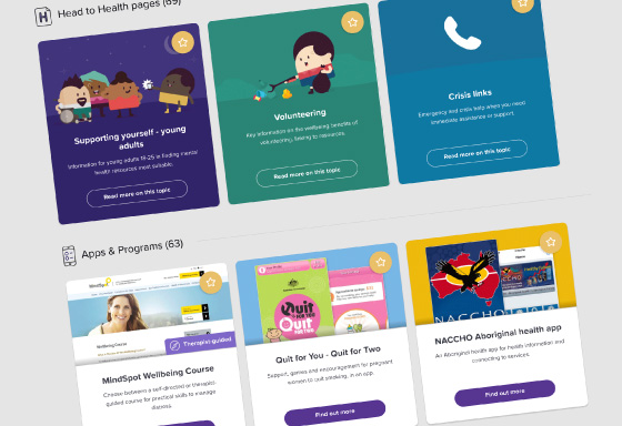
If users are looking for introductory information, they can by browse topic pages, which describe key concepts and experiences, and recommend a basic set of cards. We developed a modular page authoring system and design templates that give use some flexibility in page design while maintaining consistency.
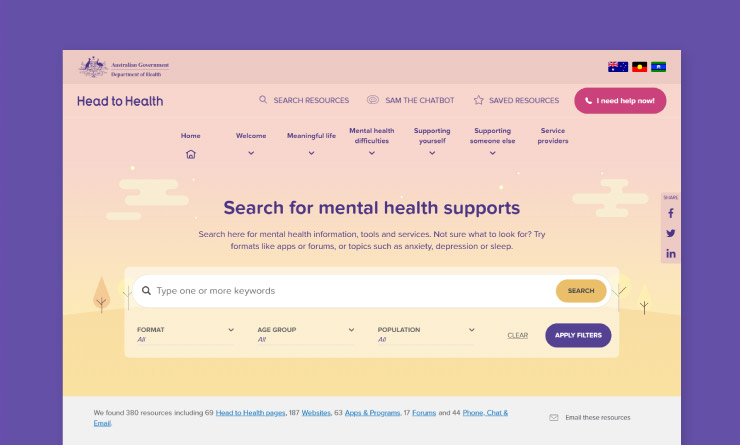
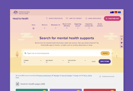
Search was designed for users with high-mental health literacy and low to medium level of distress. It needed to account for the fact that users may not know what to type, and that cards may not have exactly the keywords that an average consumer might use, so we had to undertake some fairly complex business rules design and software development to get it working.
The search corrects spelling errors, eliminates stop words, maps keywords to symptoms, conditions and lifestyle factors. It then repeats the process for two-word and three-word phrasal combinations, to produce a range of possible interpretations of a single search. These interpretations are then scored and the results are displayed in categories. Finally, cards of equal score are randomised within the result set.
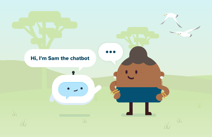
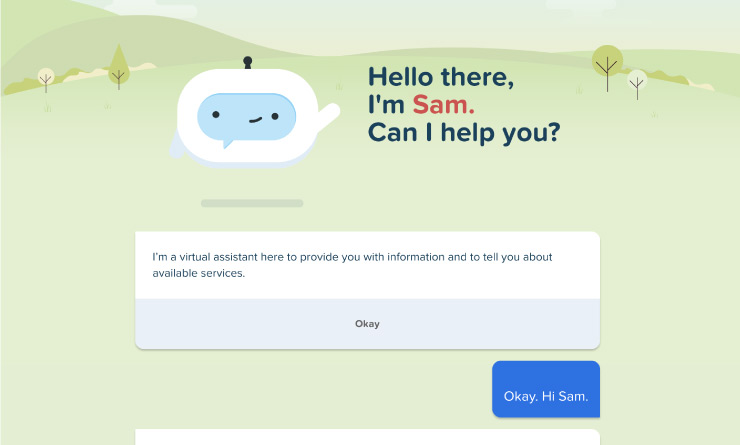
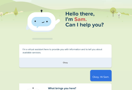
Sam provides a pathway for users with low mental health literacy and low to medium distress. Sam lets users describe an experience in natural language, breaks down the query into keywords, classifies those keywords, asks the user to disambiguate and refine results, and then recommends appropriate resources. Though it is described as a chatbot, Sam is more a highly specialised utility that uses an avatar and chat-like interface to create a more personal, supportive experience than straight search.
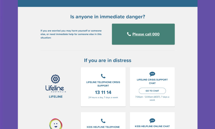
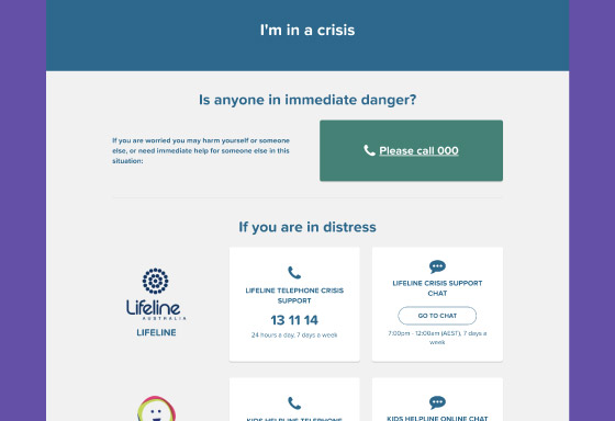
Finally, the crisis page provides immediate support for users in high distress. Technically one of the simplest pages in the site, the real challenge with a page like this is agreeing on what criteria should be applied to services on the page, and then agreeing which services meet those criteria, because ultimately users in distress want a clear next step.
The results
The co-design process channelled the wisdom, experience and insight of this complex stakeholder group and translated it into a product that sets a new benchmark in the sector.
Designing a large-scale, whole-of-population service like Head to Health will always be a challenge. Although the goal sounds straightforward—make it easier for everyone to find mental health services—there are a lot of hidden complexities, conflicts and challenges to be resolved. The Liquid way is to assemble a diverse team to engage deeply in the details and create a service that has a genuine impact.
But the most satisfying part of creating Head to Health is the way it has developed a distinctive personality and role in the mental health sector, supportive, positive and rigorous, but with its own visual world and gentle sense of humour.
An externally commissioned report found that the vast majority of users appreciate the site, with more than 85% of users surveyed recommending it to others.
“I think it’s great. I think it’s brilliant. I think this is really needed actually. It kind of gathers all the resources. I really like the way it’s been divided up, self help, professionally guided. Overall a great website to use.”
“Overall, really liking it. Lots of information for workers, carers, family and friends and people suffering from mental health issues. I like the colour and animations. It’s easy to navigate. I like the assistant. I like the big red button for I need help now, and I like that it links you to chat. I would certainly recommend to somebody.”
“Even though mental health is ‘scary’, the website makes it seem less intimidating.”
“For somebody searching for help, not knowing, not having a worker or case manager, something like this would be really helpful. I would use it for my job and I would recommend. I think it’s really cool. It’s exciting.”
