How many people use their phone to buy a car?


When we first started working with Isuzu Ute Australia (IUA) we talked a lot about how we should cater for mobile users: make a dedicated mobile site or a responsive website?
We wanted to go responsive, but that would have required a complete redesign of IUA’s existing website. Was that possible in the time available? No. Was it necessary? Maybe, but it was hard to justify because we didn’t have any mobile behaviour data. We couldn’t definitively answer the question of whether or not customers would really make a high-value purchase like a car on their phones.
“When we have facts, let’s use facts. When all we have are opinions, let’s go with mine.”— Jim Clark, founder of Silicon Graphics and Netscape
We made a standalone mobile website with limited functionality, but there were downsides to this and the LI strategy team were always quick to point them out:
This mobile site is second priority compared to the desktop site, so it has fewer features and inconsistent updates. The split between sites means you can’t even send something as simple as an email without causing development headaches. We should be giving customers a better experience. The site should be responsive.
Then, in mid 2013, the IUA marketing team briefed us on a major update:
It could have been straightforward: put new menu items on both desktop and mobile sites, add some new product pages, add some extra options in the buying tools on desktop. Just extend what was already there.
But to the LI strategy team the launch of this new vehicle was a one-off opportunity:
Complete redesign. Make it responsive. The MU-X is our chance to push it through.
And the IUA marketing team agreed:
It’s the standard now. Even YouTube has gone responsive.
But while everyone on the digital marketing side agreed this was the right thing to do, we still had the legacy problem.
Making a single responsive website would be more complex, more time-consuming and more expensive than extending the existing sites.
Why would IUA senior management ever agree to do it?
Selling to senior management
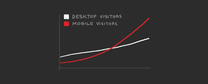
But by now we’d collected plenty of data through Google Analytics to show mobile traffic increasing across the board: increased visits, session times and conversions, for all ages, genders, locations.
It seemed like there wasn’t anything users weren’t willing to try on their phones.
At the same time, we read Google’s Automotive research report for the year, which demonstrated that a customer interacted with up to 30 online touch points (such as reading reviews, watching a video, downloading a brochure) before making an automotive purchase decision. If you wanted consumer confidence you needed to provide as many of those touch points as possible.
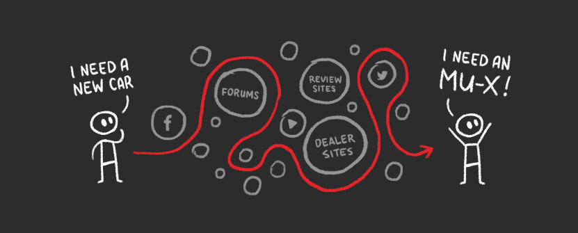
So this was the pitch to senior management:
If we wanted buyers, we needed to provide touch points, and the buyers were going mobile.
We were recommending taking this rare opportunity — the launch of a new vehicle — to do what needed to be done.
Make a great responsive website. Make it a great experience. Provide as many touch points as possible. Convert visitors to customers.
The IUA marketing team took the recommendation to their senior management.
They came back with good news and bad news.
We can do it. We can make a new responsive site. But we can’t change the launch date. The MU-X launches in December. The site has to be ready in 12 weeks.
Punching above our weight
This all sounded great, but we had a second problem to deal with.
A serious problem.
IUA’s competitors are companies like Toyota, Holden and Ford: giants, with an enormous range of vehicles and models, huge marketing budgets and deep history with consumers.
In contrast, Isuzu UTE was new to the consumer market, had only one vehicle model — although it was about to double that range — and had relatively modest marketing budgets.
We wanted to get into the fight, but we were going to need to punch way above our weight.
We had to find leverage.
Newbies need journeys, regulars need utilities
From a web design perspective we figured there were two things that we could do to pull ahead of Isuzu UTE’s competitors.
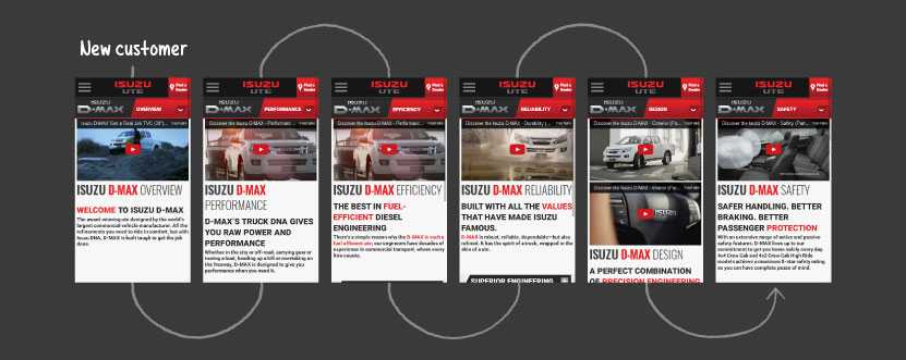
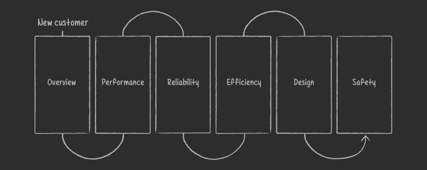
Taking new customers on a journey. Isuzu UTE was still relatively new and many consumers didn’t really know why their vehicles are better than Toyota, Ford or any of the other big players. We needed to find a way to differentiate — but the problem was that car manufacturers all say the same thing: our vehicle is powerful, reliable, efficient — and customers are left to choose based on price and design. We really wanted to help customers get to know the vehicles intimately, and truly appreciate what Isuzu UTE might mean for them.
Giving serious customers effective tools. Automotive sites have standard interactive elements: a build and quote tool, a model comparison tool, a dealer finding tool and so on. Many automotive sites were struggling to fit these tools elegantly on mobile, but if we wanted to own as many of those automotive purchasing touch points as possible we needed to solve the layout problem and provide a great experience on any device.

Three weeks of post-it notes
We tackled the journey problem first. The key to this was learning enough details about the vehicles.
Twice a week for three weeks we got together with the IUA team and talked through both the D-MAX and MU-X vehicles to us, from scratch. This sounds easy, and at the start it’s certainly fun because everyone is fresh and enthusiastic and loves free muffins, and you quickly plaster the walls with brown paper and post it notes.
But by week three it’s become hard work: mining for detail, cutting for clarity and committing to a linear structure, for little apparent reward other than more brown paper and post-it notes.
However, at the end of the process what we had was a very detailed account of what made the D-MAX and MU-X special, and all these details were arranged in an order so we had a coherent, compelling journey for customers new to Isuzu UTE.
Next, we had to work on the tools for people interested in buying.
Squeezing a lot of items into a tiny space
While the vehicle journeys naturally suited responsive design, the buying tools were tough.
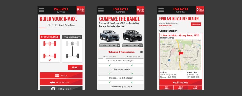
For instance, with a build and quote tool you have all sorts of options you need to find homes for, customers don’t know what half of the options mean so you need space for explanatory labels and illustrations, and what someone needs to do to choose a cab type are different to choosing a paint type.
Meanwhile, over in the vehicle comparison tool, you need a minimum of three columns of information — one for headings and two for vehicle details — and while those three columns are easy on desktop, there’s not the same room on a phone and you really need a different approach.
So figuring out these tools meant more workshops with the IUA team, eating chicken wraps and muffins as we moved interface elements around and around, like we were trying to solve a jigsaw puzzle.
Slowly the team developed a series of designs that felt like best of breed approaches, informed by what competitors had done well in the past, but also hopefully inching the field forward with some new ideas.
The race to the finish line
By the time we had final designs, we had six weeks left to build the site. On the surface the new site looked simple, but underneath it was big, complex and had a lot of data to handle. And while the design was looking great in Photoshop, it had subtle interactive and responsive behavior that required serious coding chops and extensive cross-device testing to work properly.
The director of the LI development team had known from the start that the development phase would be challenging, so he set his team working on individual site components as soon as their designs were stable. For instance we had a working responsive navigation system well before any pages had been detailed.
Even so, when the core designs were finally approved, the whole unit went into one of the most white-knuckle development races we’ve ever had, with a hard, media intensive deadline locked in place and no margin for error.
Despite the pressure, it was an enormously positive experience as everyone could see a great website coming to life.
Of vital importance was the commitment and effort of the IUA marketing team during development. They were under as much pressure as us, and yet they reviewed every detail and helped work through every key decision — that dedication was a major influence on the ultimate success of the project.
The day arrived. We deployed the site. Isuzu UTE launched the MU-X.
And then the traffic hit.
We knew it would be good, but not how good
The MU-X was a hot product. For a new entry in a crowded market, there was a lot of interest and media coverage. Traffic doubled almost immediately, driven entirely by the product launch.
We’d sort of expected that. We figured it had nothing to do with the new website.
It wasn’t until after the launch glow wore off — and traffic plateaued and held steady for a month or so — that things got interesting.
What we saw was a steady growth, surprisingly rapid, week after week, and a lot of that traffic was mobile. We began to see lots of interesting, surprising and sometimes quite unexpected behavior on mobile — things that would have baffled us before.
One year after launch, IUA’s total web traffic was up 200% — but the proportion of mobile traffic was up by 400%. The change was so dramatic — and so far above industry norms — that Google asked us if they could do a case study.
Which was a delight to us and to IUA. Two years before they had been a niche player in the automotive industry, and now they were on the ascendant.
